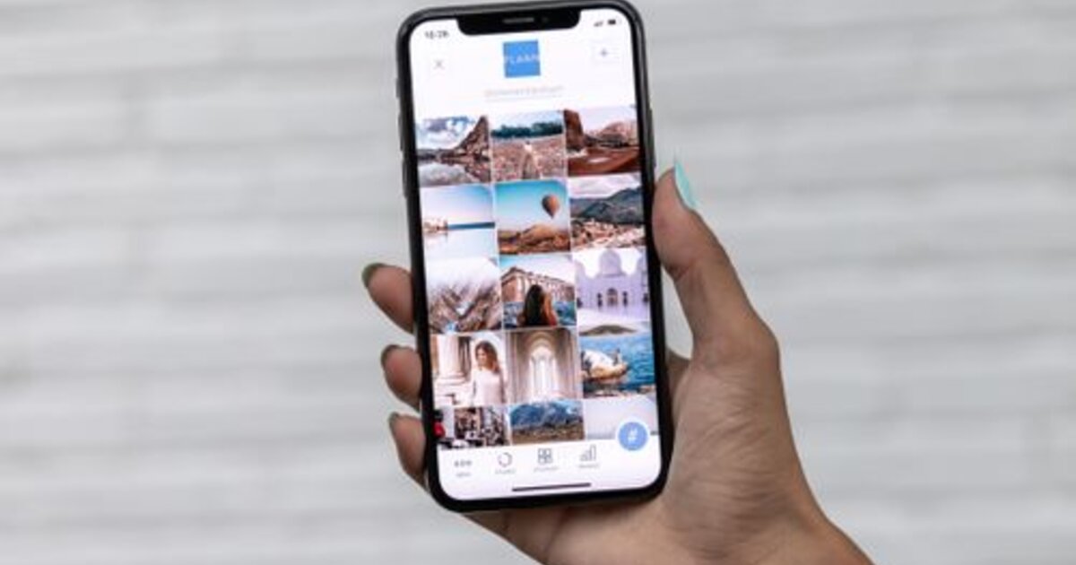
A carousel is a post of several slides you swipe through. On Instagram it's one of the highest-reach formats: each swipe holds a person longer, and the algorithm re-shows the post to those who didn't finish it. Let's break down how to build a carousel that gets read to the end and brings reach.
What a carousel is and why it drives reach
You can add up to several dozen photos and videos to a single carousel. Its main strength is retention: as a person swipes through slides, the time spent with the post grows, and that's a key signal for the algorithm. Plus Instagram may show the carousel to a user a second time, starting from a slide they haven't seen — so one post gathers more impressions than a regular photo.
How many slides and how to structure them
The optimum is 5 to 10 slides. Fewer than three don't develop the topic, more than twelve rarely get finished. A working structure:
- Slide 1 — a cover hook. A headline that promises value and makes people swipe.
- Slides 2–N — one idea per slide. Don't overload with text, lead the reader step by step.
- Second-to-last slide — a takeaway or the main tip.
- Last slide — a call to action: save, subscribe, comment.
How to hold attention to the last slide
- A hook on the cover. The first slide decides whether people swipe at all — put everything into it.
- Visual continuity. "Swipe →" arrows, an image continuing from slide to slide, a unified style.
- Rhythm. Alternate text and images, don't put two dull slides in a row.
- A cliffhanger. End a slide so people want to see the continuation on the next one.
What topics work in carousels
A carousel is perfect for content that logically breaks into steps or points:
- Instructions and checklists — "5 steps", "how to do X".
- Roundups — ideas, examples, mistakes, before/after.
- Breakdowns and mini-guides — explaining a topic in parts.
- Stories — a case or journey revealed slide by slide.
This format gets saved more often, and saves are a strong usefulness signal for the algorithm.
Carousel mistakes
- A weak cover. If the first slide doesn't grab attention, no one sees the rest.
- Text overload. A wall of text on a slide scares people off — break it into ideas.
- No call to action at the end. They finish and leave — when they could have saved or subscribed.
- Inconsistent design. Slides in different styles look messy and break the flow.
How to boost a carousel's reach
A carousel is already built for retention, but the algorithm still decides by early signals: the faster a post gathers its first likes, saves and comments, the wider Instagram shows it. So a lively start matters — post during active hours, add engagement signals and ask your audience to save the post. You can give a post an initial push with catalog promotion, so the carousel gains weight faster and reaches recommendations. And to make carousels strengthen the profile overall, keep a unified visual style — as in profile design.