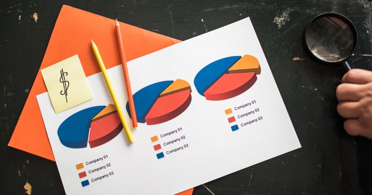
Зачем инфографика в соцсетях
Инфографика — это подача информации через визуал: схемы, диаграммы, списки, чек-листы, «было/стало». В ленте, где человек листает контент за доли секунды, инфографика выигрывает у сплошного текста: сложное считывается за один взгляд, а не за три абзаца. Поэтому такой формат отлично работает на охват и особенно на сохранения — полезную визуальную карточку хочется сохранить, чтобы вернуться.
Для эксперта и бренда инфографика — способ показать пользу компактно и красиво. В 2026 году, когда внимание аудитории на пределе, умение упаковать мысль в понятный визуал ценится дорого. Разберём, какая инфографика работает, как её делать без дизайнера и где не переборщить.
Какая инфографика работает в соцсетях
Не всякая картинка с текстом — хорошая инфографика. Форматы, которые заходят:
- Чек-листы и списки. «5 шагов к …», «что проверить перед …» — их сохраняют, чтобы применить.
- Сравнения. «было/стало», «миф/правда», «А vs Б» — наглядно и цепляет.
- Пошаговые схемы. Как устроен процесс, инструкция в картинках — экономит читателю время.
- Цифры и статистика. Один сильный факт крупно работает лучше таблицы мелким шрифтом.
- Карусели-инфографика. Разбивка темы по слайдам — топовый формат для сохранений и досмотров.
Главный критерий: инфографика должна упрощать, а не украшать. Если картинку можно заменить одной строкой текста без потери смысла — это не инфографика, а декор.
Как сделать инфографику без дизайнера
Дизайнер не нужен — есть простые инструменты и правила. Что помогает сделать аккуратно:
- Онлайн-редакторы с шаблонами. Canva, Supa и аналоги дают готовые сетки — остаётся подставить свой текст и данные.
- Единый стиль. 2–3 фирменных цвета, один шрифт, узнаваемая сетка — так карточки складываются в единую ленту.
- Одна мысль — одна карточка. Не впихивайте пять идей в один слайд, разбейте на карусель.
- Воздух и иерархия. Заголовок крупно, детали мельче, достаточно пустого пространства — перегруженную карточку не читают.
Шаблоны экономят часы и держат единый стиль — это часть системного подхода к контенту, о котором мы писали в статье про контент-план для SMM.
Инфографика и алгоритмы: почему это про сохранения
Инфографика особенно ценна тем, что провоцирует сохранения и репосты — а это сильные сигналы для алгоритмов:
- Сохранения. Полезную карточку сохраняют, чтобы вернуться, — алгоритм считает это высокой ценностью контента.
- Репосты. Наглядным полезным визуалом делятся с друзьями чаще, чем текстом.
- Время на карусели. Пролистывание слайдов повышает время взаимодействия с постом.
Добавляйте призыв «сохрани, чтобы не потерять» — как и любой контент, инфографика работает лучше с чётким призывом к действию (см. статью про призыв к действию).
Где не переборщить
Инфографика — инструмент, а не самоцель. Частые перекосы:
- Форма важнее сути. Красивая карточка без реальной пользы не сохранится и не сработает.
- Перегруз данными. Десять графиков на одной картинке никто не разберёт — упрощайте.
- Мелкий текст. В ленте всё смотрят с телефона: если не читается — контент бесполезен.
- Только инфографика. Живые видео и личный контент тоже нужны — чистая «графика» делает аккаунт безликим.
Инфографика — сильный формат для полезного контента: она упаковывает сложное в понятный визуал, собирает сохранения и репосты и укрепляет экспертный образ. Главное — чтобы за красивой картинкой всегда стояла реальная польза для читателя.